Website Functionality
This portion of the essay will focus on analyzing the usability of the most consequential sections of the SCP wiki: the navigation menu, the homepage, and the SCP article pages, using Krug’s Don’t Make Me Think, Revisited: A Common Sense Approach to Web Usability as a reference.
Although the SCP wiki has a curation system to ensure articles of low quality are removed fairly quickly, the site staff try to ensure a level of quality from the get-go by making the process to sign up to write for the SCP wiki, as opposed to the rest of the site, difficult and unintuitive. As Krug would say, the process requires you to think¹.
Navigation Menu: Somewhat Intuitive
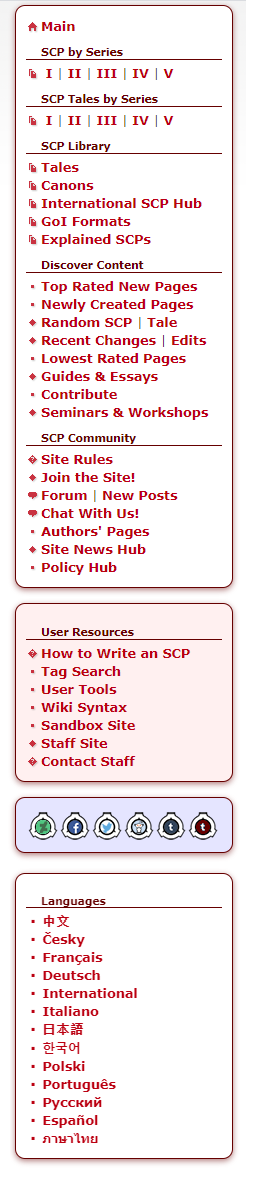
To begin with, it is worth taking a look at the site’s main navigational menu found on the left side of the screen. This navigation is present on all pages of the site and does not change. It contains easily intuitable clickable links to all the important parts of the site, with the popular SCP Articles placed front and center. This makes the articles quick to access.
There is, however, a little ambiguity as to what a “series” is, and what the preceding roman numerals mean; they are not self-evident. Further, the word “articles” is not used to describe the report-style creepypastas. Rather, these articles are differentiated from SCP tales only by the absence of the word “Tales.”
Thankfully this ambiguity is partially compensated for by the success users will be met with utilizing basic trial and error. Reading top-to-bottom, left-to-right, the first clickable link will lead directly to the page most users of the SCP Wiki will be looking for: the original one thousand SCP articles. This trial and error will likely be the intuitive first step for anyone who has come to the site with any understanding of what an SCP article is.
The other links in this navigation menu range from self-evident, as is the case with “Canons” “Top Rated New Pages” and “Tales” (although it’s not immediately obvious what separates “Tales” from “SCP Tales by series”) to those links that Krug would say require thought, such as “GoI Formats,” “International SCP Hub,” and “Guides & Essays,” and even those links with misleading names such as “Explained SCPs” that users might intuit to mean, article pages that guide the reader through, and explain, how SCP’s work. In reality “Explained” SCPs are a specific category of SCPs which detail objects that were originally thought to be anomalous phenomena, but ended up not being anomalous after more scientific research was conducted.
Thankfully, the site’s various translations remain easy to access through this navigation menu, displayed in a simple and familiar format: each language stating its name using its native alphabet. Nothing is hidden inside of a drop-down box that would obscure the translation links from those who do not speak English.
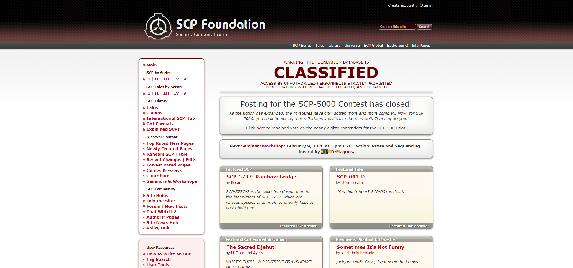
Overall the navigation menu requires a minimum amount of thought to access pages average users are concerned with reaching. Pages of more consequence to experienced users and content creators require more thought. Overall, perhaps the greatest drawback of the navigation menu is that between itself and the home page on which it first appears, there is a lot going on, This may cause the home page to overwhelm a new user upon first seeing it.
Home Page: Not Intuitive
Said home page, incorporates some page elements in a way that may not be immediately familiar to users used to browsing blogs and popular websites. Popular articles of four different types are organized into four cards, organized in a 2×2 arrangement, which is fairly atypical. Even more confusing is that the titles of these cards are NOT clickable, while the card’s footnotes — with the same font and text color — are clickable. This contradicted my standard intuition, that the title of a page element that points to another page should be clickable itself.
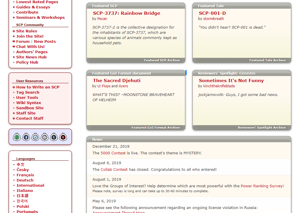
This unintuitive clickability trend continues with the next section of the homepage which is labeled as “News.” Typically users might expect a News section to contain a selection of recent articles, each with a summary and a title that can be clicked to reach the full article. This is not the case for the SCP Wiki, where News segments do not have titles, and instead, have hyperlinks to relevant pages embedded in the news “summary” itself.
In fact, as it turns out, the News section of the SCP wiki does not appear to host news articles at all, as would be one’s first intuition; rather it only includes brief, and infrequent updates that sometimes contain hyperlinks to referenced pages, relying on those pages to explain themselves.To top it all off, the News section’s title is not clickable to reach a more expansive list of news posts throughout time. Rather users must click an “archived news” button in the footnote of the card.
Overall the home page not only requires users to think about what titles like “News,” “Featured GoI Format document,” or “Reviewers’ Spotlight: Cerastes,” actually mean, users are also forced ponder what text on the home page is and is not clickable, critical errors when designing a web page, according to Krug.
Article Pages: Very Intuitive
Compared to the homepage and the navigation menu, SCP article pages are very simple. Each article contains the type of written content discussed in the Website Content portion of this essay, which typically follows a predictable formula and almost always follows the same format. Each article may or may not contain a single image — always nested in the top right of the screen — and each article contains a rating widget nested in the top right of the screen (above the image, if one is present).
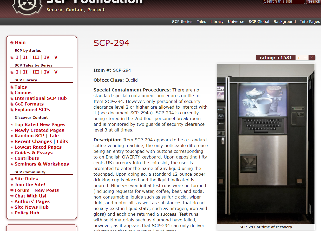
The rating widget is an integral part of the SCP Wiki as a whole. It’s simple to use, and its surface-level purpose is self-evident: it allows users to quickly voice their opinion as to which articles are entertaining and fit the SCP cannon, and which do not.
But the rating widget serves another related purpose: pages that receive too many downvotes are quickly removed from sight and are marked for deletion, freeing up space for better articles to take the place of the original article thus increasing the ratio of high-quality posts to low-quality posts. This is the SCP Wiki’s primary method of quality control as a website that relies on user-generated content. It is robust, simple, and involves a moderative step before the article is totally deleted to prevent trolls from deleting popular articles.
Overall the function of the SCP Article pages are incredibly self-evident, owing to their simplicity. Holding to Krug’s gold standard, no thought is required. Content is easy to consume and rate. The ease of use of Article pages, combined with the questionable usability of the homepage explains in-part why some users, such myself, will often simply google search the title of an SCP article we’re looking for and use the search engine to take us directly to the article.
Essay Table of Contents:
<- Previous | Next ->
- https://eng317hannah.wordpress.ncsu.edu/files/2020/01/Krug_Steve_Dont_make_me_think_revisited___a_cz-lib.org_.pdf